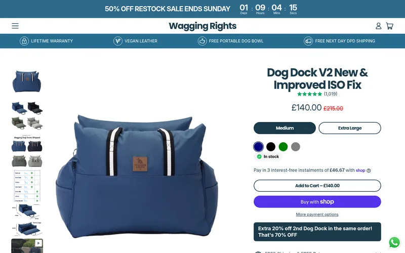
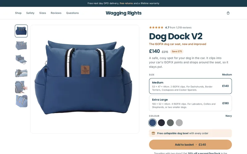
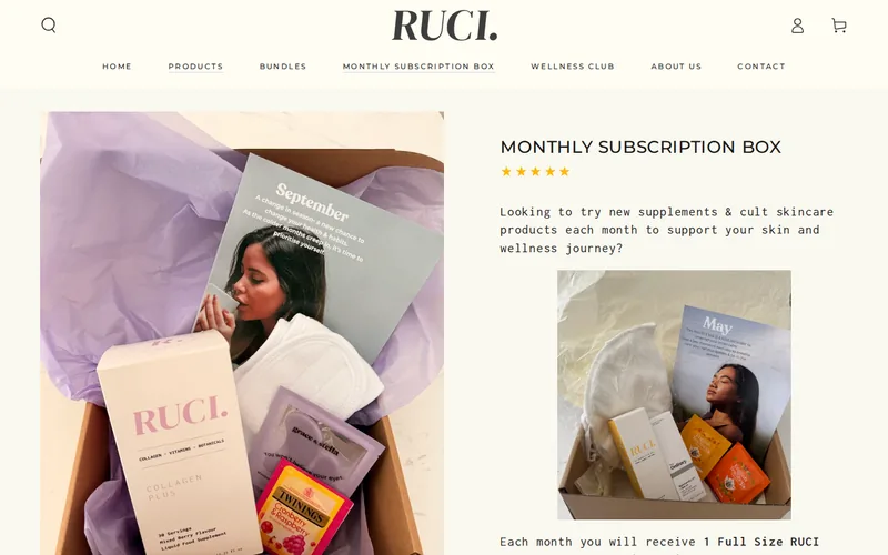
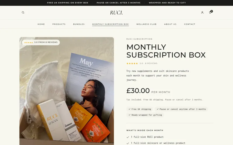
Concept rebuild, not commissioned by SISTERLY
Daily multivitamin · Product page
SISTERLY
Women's daily multivitamin · sisterlylab.com
 , opens in a new tab
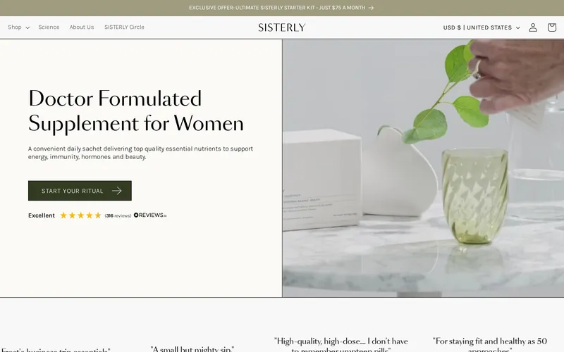
The problem
- No product and no price on the first screen
- A vague Start your ritual button that does not say what happens next
- The best offer is hidden in a thin banner above the logo
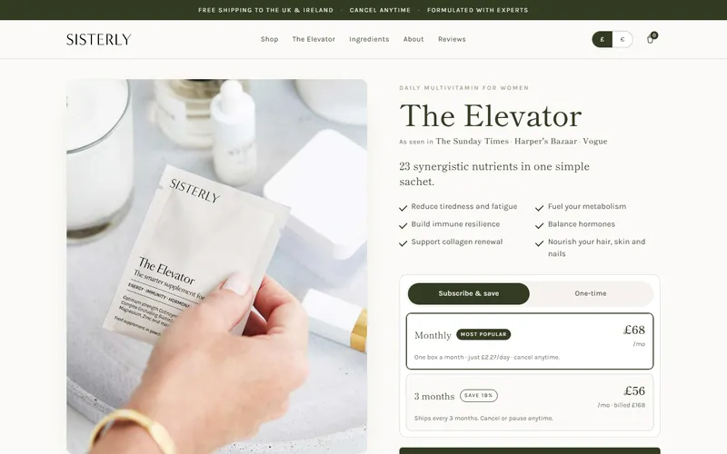
The fix
- Product, price and the subscribe or one time choice on the first screen
- Free gifts and the real saving shown where you pick a plan
- Rating and the pause or cancel any time promise right by the button
Why this fix
A shopper on a product page needs three things before anything else: what it is, what it costs and how to buy it. The original page led with a lifestyle photo and a button that did not say what happens next. Putting the product, the price and the plan choice in one view makes the first screen the decision, and showing the gifts and the saving where the plan is picked puts the offer at the moment it matters.
How we would measure it
- Metric
- Add to basket rate: the share of product page visits that add to basket. We would also watch how many people choose the subscription.
- Test
- An A/B test on the same traffic: half of visitors see the original page, half see the rebuild. We would run it for at least two full weeks, so weekdays and weekends both count, and until the difference is clear rather than noise.